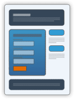
 Over the last two years I’ve been constantly working to improve the landing pages we use to try and convert interest in one of our books into a purchase. The latest iteration of the design is now fully responsive, allowing people to read a sample of the first four chapters of ‘Lights Over Emerald Creek on their smartphone. That said, I’m not actually sure why someone would want to read a book on their smartphone, but they can. More importantly, with the addition of the QR code to our book-business cards I thought it important that when someone did scan the code they were provided with a page they could actually read (see [p2p type=”slug” value=”marketing-101-for-authors-business-cards-for-books”][/p2p]).
But first, back to basics, what is a ‘landing page’?
The use of a landing page
Unbounce.com state that “In the purest sense, a landing page is any web page that a visitor can arrive at or “land” on. However, when discussing landing pages within the realm of marketing and advertising, it’s more common to refer to a landing page as being a standalone web page distinct from your main website that has been designed for a single focused objective.
This means that your landing page should have no global navigation to tie it to your primary website. The main reason for this is to limit the options available to your visitors, helping to guide them toward your intended conversion goal.
Click through landing pages (as the name implies) have the goal of persuading the visitor to click through to another page. Typically used in ecommerce funnels, they can be used to describe a product or offer in sufficient detail so as to “warm up” a visitor to the point where they are closer to making a purchasing decision.
All too often, inbound advertising traffic is directed at shopping cart or registration pages. This leads to poor conversions as the ad doesn’t provide sufficient information for someone to make an informed decision.
This is where the click through page comes in. As a result, the destination page from a click through page is typically the shopping cart or registration page – now with a much higher chance of conversion having passed through the details of the landing page.
What makes a ‘good’ landing page?
The following list was originally based on a post by kissmetrics.com but has been modified by myself to reflect the specific requirements for book:
- Clear and concise headlines
- Impeccable grammar
- Taking advantage of trust indicators
- Use a strong call to action
- Buttons and call to actions should stand out
- Go easy on the links
- Use images and videos that relate to the copy
- Keep it above the fold
- Always be testing
- Make the page responsive
As you can see from the landing page designed for ‘Lights Over Emerald Creek‘ we have:
- included the cover as a floating image on the left hand side of the screen
- provided direct links through to the book on major bookstores website (including our own)
- a short blurb
- one stand-out review, with the ability to read more reviews if the reader wants to
- ensured that the vignettes (section separators) reflect those used in the book
And now, all I have to do is to update the older landing pages to the newer, fully responsive design…

